In this fast-paced digital world powered by AI, web design trends are changing significantly. People are no longer impressed by plain static websites, they need something interesting and interactive.
Considering this digital shift, businesses need to adapt to new changes in their websites, and why not, this is what creates the first impression.
Now, for that, you must know what’s in and what’ out in the design trends of websites. This is what we are going to discuss in this post.
The key to creating a website design that stands out is to balance creativity with usability. Let us now explore top 5 web design trends in 2025 that are shaping the digital landscape.
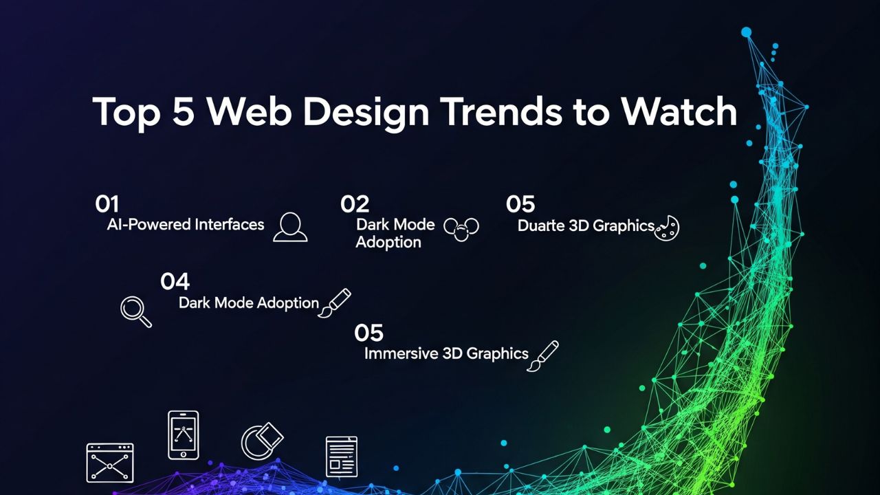
Top 5 Website Design Trends You Must Know in 2025
1. IN: Immersive 3D and Interactive Elements
OUT: Flat, Static Pages
Gone are those days when static pages with different designs used to attract users. Although, such designs were best to provide necessary information, but they made the webpages lengthy, leaving users keep scrolling.
Today, users vouch for interactivity and emotional engagement. This is one of the reasons why 3D visuals and motion elements are creating a huge impact.
Interactive 3D models, hover effects, micro-animations, and immersive transitions are liked by the users more than flat content. For example, an architecture firm might showcase a rotating model of a building rather than static images.
An apparel brand could use augmented try-on features, helping customers see how a product fits in real-time. Even simple 3D graphics add dynamism, giving a site a tactile, modern feel.
Why Such a Design Matters?
- Visitors are more likely to recall interactive experiences rather than something they just read in plain text.
- Brands can guide users through a journey rather than simple navigation.
- Modern audiences, especially younger demographics, expect interactivity as a standard.
What’s out?
Designs that rely solely on flat images and plain text are becoming old school. People are finding such designs outdated. However, we must say that simplicity is important, but overly static pages will get you nowhere.
2. IN: Dark Mode and Adaptive Color Palettes
OUT: Overly Bright, One-Size-Fits-All Themes
There was a time when bright colors with bold accent used to rule web design industry. However, screen time was not that much during that time.
Here, with increasing screen time, dazzling white pages are no longer preferred by users. Such designs strain the eyes. This is why dark mode and adaptive design themes are becoming popular.
Dark mode isn’t just functional, it’s stylish. With sleek contrasts, deep tones, and accent highlights, it brings a modern, tech-forward look while reducing screen fatigue.
Many websites now offer users the flexibility to toggle between light and dark themes. More advanced sites even adapt their palettes based on time of day, device settings, or user preference.
Why Such Color Palettes Matter?
- Reduces visual strain for users browsing for long periods.
- Provides a clean, futuristic aesthetic paired with strong contrast typography.
- Puts accessibility and personalization front and center, users feel in control of their experience.
What’s out?
When high screen is becoming a part of daily lie, bright, rigid themes are fading fast. If a design fails to provide users to adjust accordingly, it will not be preferred. Today, personalization has become a must.
3. IN: AI-Driven Personalization & Smart UX
OUT: One-Path-Fits-All Navigation
In earlier web design eras, navigation menus guided every visitor through the same experience. Whether you were a first-time guest or a long-time customer, paths were linear and predictable. That’s no longer good enough.
AI-driven personalization is transforming web experiences by tailoring content, visuals, and navigation to individual users. A first-time visitor may see an onboarding flow, while a returning user is greeted with recommendations based on browsing behavior.
Retail sites can curiously suggest “what you’ll love next,” and educational platforms can highlight courses aligned with a learner’s progress.
Smart UX also adapts to context—delivering simplified elements for mobile screens, predictive search, and voice-friendly design. Instead of overwhelming a visitor with endless options, websites learn and serve up exactly what’s relevant.
Why Smart UX matters?
- Cuts down on friction, making browsing faster and more intuitive.
- Increases conversions since users are presented with content suited to their needs.
- Builds stronger emotional connection between brand and audience.
What’s out?
Traditional navigation-heavy websites where everyone follows the same multi-click path are losing steam. In a fast-moving world, users want instant relevancy, not maze-like menus.
4. IN: Sustainable & Performance-Driven Design
OUT: Heavy, Resource-Intensive Websites
Sustainability isn’t only a buzzword in fashion or manufacturing—it’s becoming a central theme in digital design as well. Every image, video, and script loaded onto a site consumes energy. With internet usage contributing to global carbon emissions, developers and designers are rethinking how to optimize websites for speed, efficiency, and sustainability.
Lean design practices—like compressed images, reduced code bloat, and lighter frameworks—are becoming standard. Brands are even showcasing their commitment to “green design” as part of their identity. Beyond sustainability, performance is also critical.
Users won’t wait more than a few seconds for a sluggish site to load, and search engines prioritize fast pages in their rankings.
Why Performance-Driven Design Matters?
- Appeals to environmentally conscious users and aligns with global sustainability goals.
- Improves accessibility globally, especially in regions with slower internet speeds.
- Enhances SEO and boosts conversion rates through faster, frustration-free browsing.
What’s out?
Websites overloaded with uncompressed media, autoplay videos, or unnecessary widgets are quickly becoming unattractive. In 2025, performance and sustainability are no longer optional—they’re the backbone of good design.
5. IN: Inclusive & Accessible Design
OUT: Exclusivity in Functionality and Style
With rapid web design changes, one of the most significant change that we have encountered is inclusivity.
This means optimizing your website for diverse group of audiences. In other words, your website must be accessible to everyone, irrespective of whether he/she is visually impaired. Let’s break it down further.
To make your website accessible, you need to add features like high-contrast modes, text-to-speech-friendly formatting, keyboard navigation, media captions, and scalable typography. With such features in your website, you will ensure that every single user has a rich experience, without being left out.
Why Accessibility in Web Design Matters?
- Accessibility expands reach to millions of users who previously felt excluded.
- It’s fast becoming a standard expectation, brands risk reputational damage if their sites are not inclusive.
- An inclusive approach signals empathy, humanity, and authenticity, values central to trust-building online.
What’s out?
Designs that ignore accessibility guidelines or target only one type of user. Websites without alternative modes of usability are fading, as they neglect the real diversity of online audiences.
The Last Say
Web design is not only about following the latest trends, but is to identify the needs of changing audience and implementing them.
The best web design is the one that resonates its audience. In this post, we have highlighted top 5 web trends that are shaping the ever-changing digital landscape. Here’s the recap:
What’s In:
- Interactive and 3D experiences
- Adaptive dark/light mode
- AI-driven personalization
- Sustainable, high-performance websites
- Inclusive and accessible features
What’s Out:
- Overly static, flat designs
- Standardized bright themes for every visitor
- Linear “one-size-fits-all” navigation
- Resource-heavy, slow-loading websites
- Designs that exclude users with different abilities